New Topic

Wedge 08 Poster?

  • slider
    June 2008
    just went to see the article for the upcomming wedge classic contest and saw the new poster for the contest...

    im not having a stab or trying to piss people off but hasnt the "guy with wings" been used before? And what does a guy with wings have in common with bodyboarding? It shows nothing about what bodyboarding is all about? the wedge in plett has insane waves...couldnt the image be of the wave or something?

    Is this going to be the contest t-shirt?

    I dont know, mabye im being a idiot, what say the other users?

Bodyboarding 977 views

9 Replies

  • GMan
    June 2008
    I agree..last years poster/marketing was much much better than this years..it looks like a 5 min photoshop job?

    Surely it oculd be done much much better than that....

  • June 2008
    red bull = wings = flying high !!!

    im not to sure and wont vouch for anyone or side... its a hit and miss when doing posters for events as can never please everyone ;)

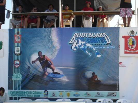
    yes its cool to have a wave for a poster also, but doesnt always have to be nowdays and sometimes always chucking a wave up as a poster looks pretty lame..

    my 2 cents worth.

    chow for now. back to work
  • craigtrilivascraigtrilivas
    June 2008
    Ja a wave is ok but ur looking at waves at the same time so i think its still ok to hav just graphics even.
    But ja I also thought the one Pipe contest one with Brandon Foster on the billboard was pretty cool too.
    Anyone else see that one?

  • June 2008
    which one was that? only saw this one from this years...can you find it and attach it please?

    piipeline_pro_POSTER_USBA.jpg
  • Jared HoustonJared Houston
    June 2008
    I think it looks sick.

    Simple and stylish and serves its purpose.
    The wave is overrated anyway(Lol).

  • June 2008
    well put jerry.... lol
  • Spy Dude
    June 2008
    there should be a poll on this, i dont think its that rad, but hey, thats my opinion.
  • Chinnychinchin
    June 2008
    I think the concept is very cool. Duo-tone pink/black can work nicely and I like the idea of a sponge giving someone wings. But from a composition point of view it's not communicating the information strongly enough as all the focus is drawn from the heavy plus sign on the left to the bleed off wing on the right down the HUGE amount of blank space on the right hand side to the massive black plus signs. All I see is black graphic lines and pink guy with wings and a huge date below, which could look like a protest of some kind.
    I'd say thin the heavy black lines, make the text more prominant, try the sponger in black, plus signs in outline only, maybe even encorporate them into the black lines to draw them to the background.

    Thats my opinion.
  • craigtrilivascraigtrilivas
    June 2008
    here it is mark.
    I think that the 2 versions of the sport on the ad give the average joe who doesnt know much about the sport a better idea of wat it is we do :mrgreen: and that its not like standup in that its got different styles to it.

    brandon-foster-punta-colarodo.jpg

    The current poster is rad too, fresh, different.
    Lekker.
  • Post a Reply

    You must be logged in to reply to this topic.

Copyright © 2025 Sixty40 Bodyboarding. All rights reserved.